15 Essential Charts for Every Investor

March 28, 2024
3 min read
"The biggest risk is not taking any risk"
– Mark Zuckerberg
arvy's teaser: In today's special edition, we zoom out and present our 15 essential charts for long-term investing that we think every investor should know. Happy Easter!
On average, your capital on the stock market doubles every 10 years.
The real return on equities (after inflation) has averaged 6.9% per year over the last 200+ years.
Chart 1: Asset Class Real Total Returns over 200 years
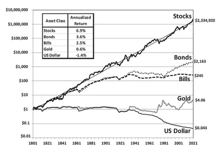
Source: Stocks for the Long Run, Jeremy Siegel
The point of no return begins at around –30%, i.e. the burden of negative performance begins to have an exponentially negative impact on your capital.
Try to avoid it.
Chart 2: The law of big numbers, the point of no return, starts at -30%
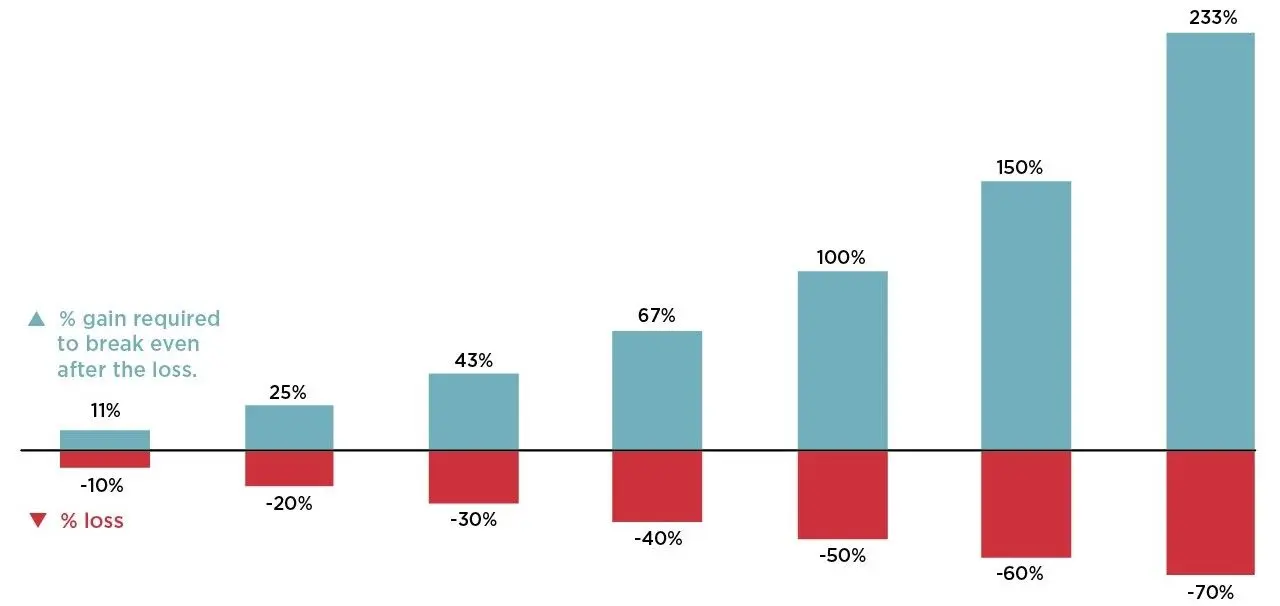
Source: Nationwide Financial
You make far more money by holding through bull markets that you lose by holding through bear markets.
Stay invested.
Chart 3: US bull and bear markets
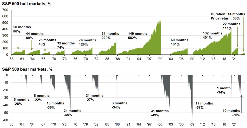
Source: JP Morgan, Guide to the Markets
There is always a good reason to sell.
The market climbs the wall of worry.
Chart 4: S&P 500 with many negative events since 2009
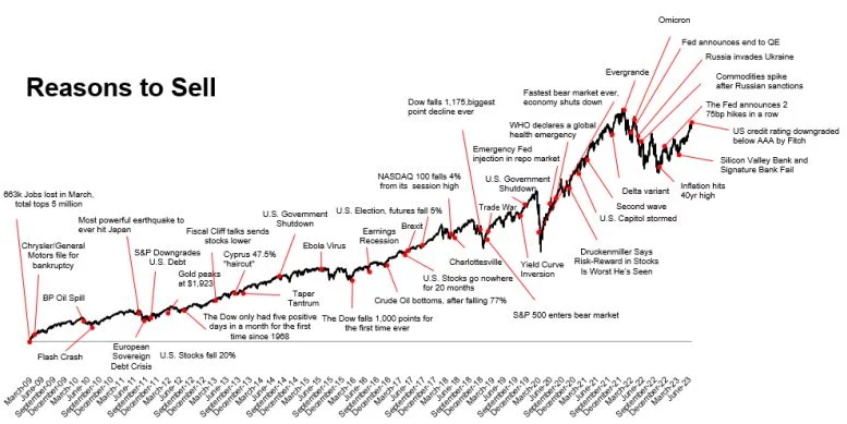
Source: Ritholtz Wealth Management
Politics and investments do not go together. Presidential elections are coming up in November 2024.
Do not worry about the outcome.
Chart 5: US stock market over the course of the US presidencies
Source: Creative Planning
In equities, the only constant is change.
Nothing is forever.
Chart 6: Share of largest sector in the US, in %
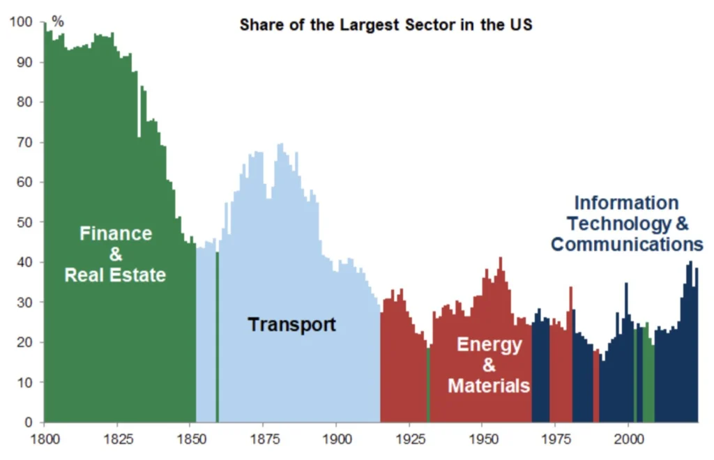
Source: Goldman Sachs
The market always follows a narrative.
Only 1 of the 10 market leaders will remain a winner in the next cycle.
Chart 7: Narrative of the top 10 companies by market capitalization
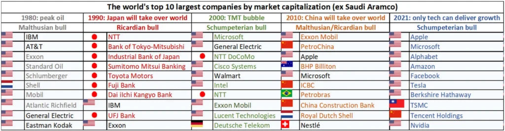
Source: GaveKal
Investing when confidence is low, i.e. anti-cyclically in extreme times, has proven its worth.
Extreme sentiment is a good contrarian indicator.
Chart 8: CEO Business Confidence and S&P 500
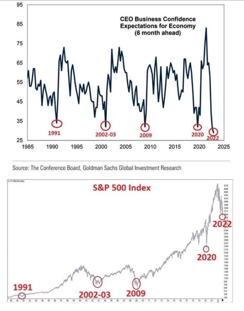
Source: Goldman Sachs
If you invest, you can lose. If you do not invest, you have already lost. Because you choose the path to lose in the long term.
Today, the biggest risk is not taking any risk.
Chart 9: Purchasing Power of the US Dollar vs Inflation Adjusted US Total Returns
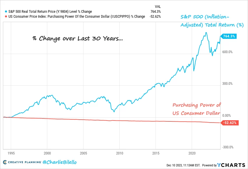
Source: Creative Planning, Charlie Bilello
The easiest way to increase your odds of success is to increase your holding period.
Time in the market is everything.
Chart 10: Total Real Market Returns and Holding Period, 1871 - 2022
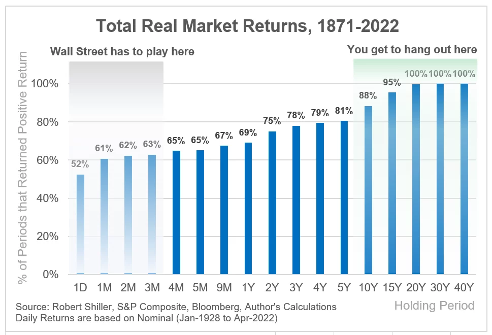
Source: Robert Shiller, S&P Composite, Bloomberg, Author’s Calculations
The holy grail to investing is a lump sum and dollar-cost-averaging.
It has never been as easy and cost-effective as it is today.
Just get started!
Chart 11: The effect of compounding, EUR 5’000 invested annually with 5% p.a. returns
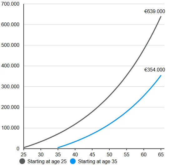
Source: JP Morgan, Guide to the Markets
Volatility is the toll we pay to invest.
Accept it.
The market corrects:
Chart 12: S&P 500 intra-year declines vs. calendar year returns
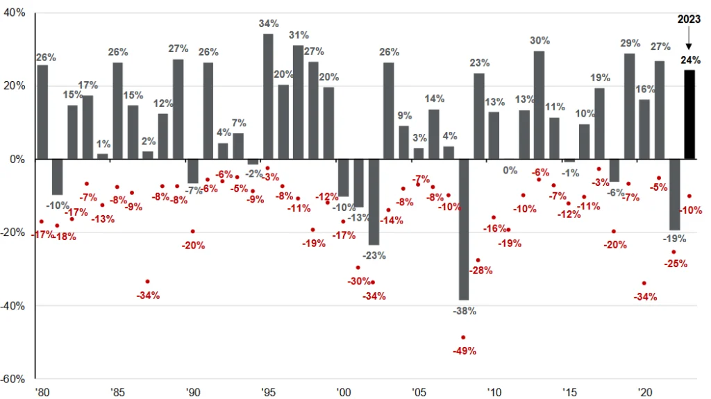
Source: JP Morgan, Guide to the Markets
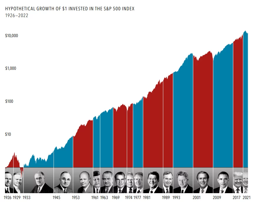
The financial market is a wealth creation machine.
At arvy, we do-it-together.
Chart 13: Total Returns of US equities, US Treasuries and a 60/40 Portfolio
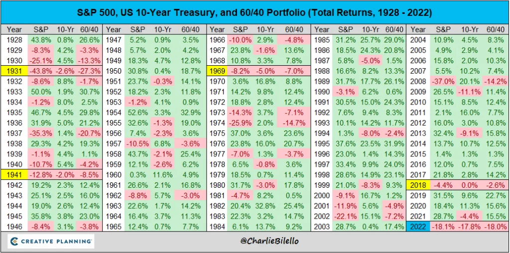
Source: Charlie Bilello
And finally, a movie every investor and entrepreneur should watch (available on Netflix), and…
Chart 14: Moneyball

Source: Moneyball
… a book every investor and entrepreneur should read.
Chart 15: The Richest Man In Babylon
Source: arvy’s book club