As Goes January, So Goes the Year

December 30, 2025
4 min read

“As goes January, so goes the year”
– Stock market saying
Stock market sayings.
I love them because they span more than 140 years of well-documented stock market history.
It’s hardly far-fetched that over such a long period, a handful of adages have left permanent ink in the books and studies that recorded them. They range from seasonal patterns like the Thanksgiving Rally or the Santa Claus Rally, to timeless lessons and hard rules investors keep close.
My personal favorites?
“The trend is your friend” and “Never catch a falling knife”.
At the beginning of every year, we pay close attention to how January performs.
And no — not the performance of your New Year’s resolutions, like sticking to “Dry January,” but the performance of the stock market itself.
Because investors have a saying of their own.
As goes January, so goes the year.
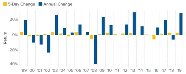
Chart 1: S&P 500 return in first five days vs. the full year
Investors tend to focus on two key statistics in January:
Together, this combination is known as the “January Barometer.”
So, what’s it all about?
Simple.
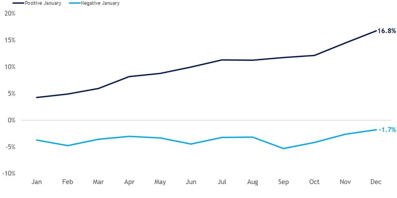
The idea is that the January performance of the S&P 500 can offer a clue about how the rest of the year might unfold. The analysis has two parts: one looks at the first five trading days of the year (chart 1), and the other examines the entire month of January (chart 2).
Proponents of the January Barometer believe that if the S&P 500 rises during both the first five days and between January 1 and January 31, the odds favor a positive year overall. Conversely, a weak January often signals a weaker year ahead.
Okay — everyone talks about it.
But is it actually true?
Yes.
Looking back to 1950, when both indicators were positive, the stock market finished the year higher more than 80% of the time. And in case you're wondering: yes, it worked well last year too. January, the first five days were up, and the month was up.
Of course, critics point out that this success rate may simply reflect a basic truth: stocks rise more often than they fall.
Fair enough — and we’ll come back to that later.
Still, interest in the January Barometer remains strong. According to the Stock Market Almanac — the creator of the concept — every down January for the S&P 500 since 1950 has been followed by either a new or extended bear market, a flat year, or at least a 10% correction.
So, Thierry — should we sell everything and go to cash if the January Barometer turns negative?
Of course not.
Chart 2: S&P 500 January Barometer (1950–2023)
When it comes to investing, the most important thing is to stick to your plan. And that brings me to another classic stock market saying:
“Markets climb the wall of worry.”
What does that mean?
Let me show you.
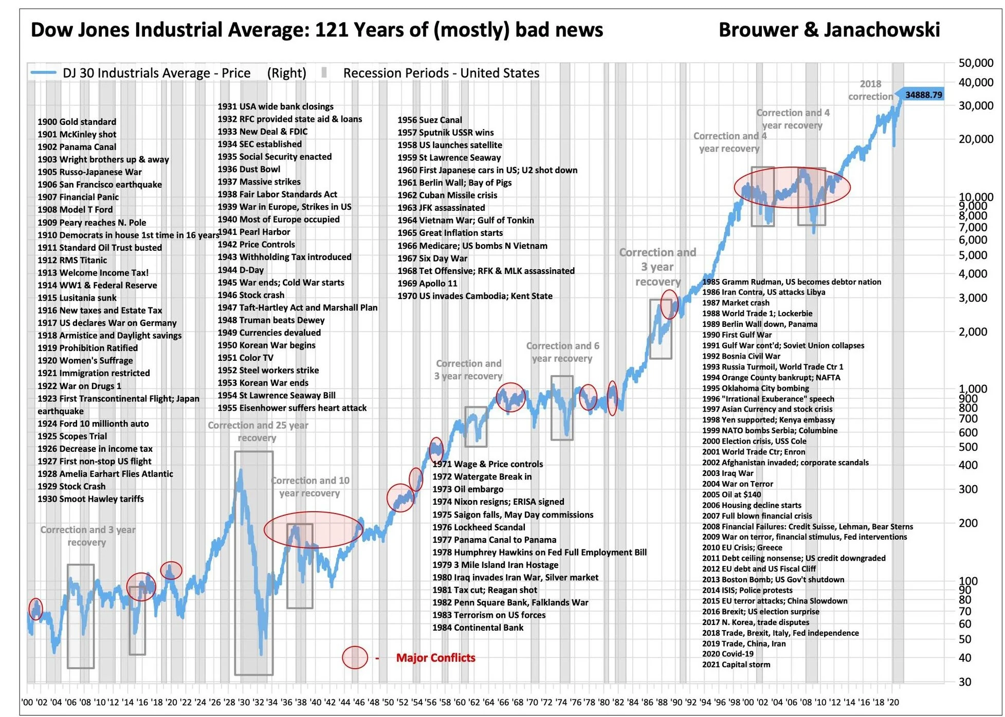
These statistics never cease to amaze me. But first, a bit of eventful history.
Since the 1890s, the stock market has been packed with reasons to sell — dramatic events that made investors question everything (chart 3):
The stock market is, quite literally, a story full of drama.
And yet — the historical annualized return of the S&P 500 over the last 100 years stands at roughly 10% (as of the end of December 2025). That figure assumes dividends are reinvested — and those dividends account for about 40% of total returns.
For those who managed to ignore the drama, the story is filled with profits.
Because the market keeps climbing the wall of worry.
On average, wealth invested in the stock market doubles every 10 years.
Let that sink in.
Okay, Thierry — I get it. Back to the opening line.
So, what is my plan?
Chart 3: Over the long-term stocks go up
It doesn’t exist.
But there is something that comes very close. And that should be your investment plan:
Lump Sum + Dollar-Cost Averaging.
Starting with a lump sum is the first step, because time in the market beats timing the market. By investing a larger amount upfront, you give your money the maximum time to compound and grow from day one.
With Dollar-Cost Averaging (DCA), you then add a fixed amount at regular intervals — regardless of where stock prices are. This removes the pressure of “perfect timing” and smooths out market volatility. When prices are low, you buy more shares; when prices are high, you buy fewer.
The beauty of DCA lies in its simplicity — and in how effectively it reduces emotional decision-making. You simply stop worrying about the January Barometer or whatever headline dominates the news that day.
This approach is especially helpful for new investors, or for anyone uneasy about market fluctuations, because it keeps the focus on long-term progress rather than short-term noise.
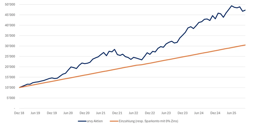
By consistently applying DCA, you allow compound interest to work its magic over time. And it doesn’t require huge amounts (chart 4). Your investments grow, appreciate, and begin to build on themselves — in this example, in less than seven years.
That’s exactly why we launched the arvy Sparplan.
All you have to do is get started.
Let’s go for 2026!
Together!
Chart 4: Lump Sum + Dollar-Cost Averaging, Example: arvy equity, $10k + $250 Monthly DCA